During recent market research, we discovered a piece of data that would change our mobile strategy for our customers permanently. The amount of time users are spending on apps is growing exponentially:
Right now, Apps account for 89% of mobile media time.
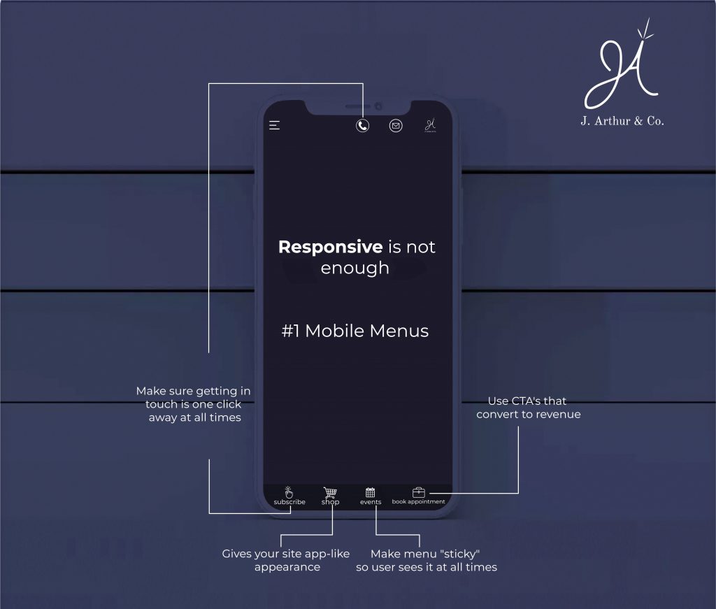
What does this mean for user-experience design? We now need to go BEYOND the concept of a “responsive mobile website,” – which is already an outdated design term, and begin to make all mobile websites “app-like.”
This is a huge percentage and means that people surfing the web (the majority of us) are becoming used to the way that apps work and guide us through what we’re looking for on the internet. With that being said- we are looking for ways to have our customer’s sites more “app-like” to adapt to the preference of the people. One change we’re making to achieve this, is to add a bar of icons on the bottom of the mobile webpage, just like nearly all apps have. It makes for one less click and also makes the mobile website look like an app, where mobile users spend the majority of their time and are therefore most comfortable using.
It’s a small adjustment but we believe a large leap in making pages and action-points on mobile websites more accessible with a faster response time. These icons save them the trouble of looking through to find the information that is most popular for our client’s customer base. Along the same lines, since users have become so accustomed to the app experience, tailoring mobile websites mirror that experience is only going to resonate sub-consciously with users, which will increase engagement and conversions.
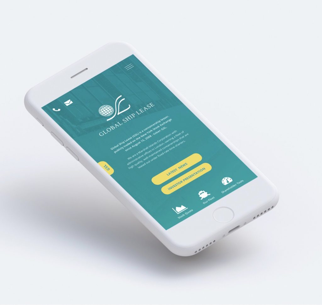
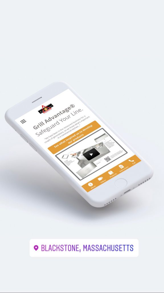
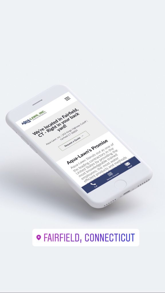
Check out a couple examples below as we work through out entire portfolio and upgrade the mobile navigation layout.