“Usability is about people and how they understand and use things, not about technology… As a user, I should never have to devote a millisecond of thought to whether things are clickable – or not.” – Steve Krug, Don’t Make Me Think
For the most part, the easy-to-use products are the most successful. Consider the major differences between the Apple iPhone and Samsung’s smartphones. High-end Samsung devices often have cutting edge smartphone technology powering their device, but Apple leaned heavily into usability and it has paid off significantly. Though usability covers a wide range of industries, in this blog, we will narrow our focus to the usability of company websites. First, we’ll cover the key components of usability. Next, we’ll underline why usability is important. Lastly, we’ll highlight how UI/UX savvy web design helped a client of ours upgrade and modernize their website. Let’s dive in…
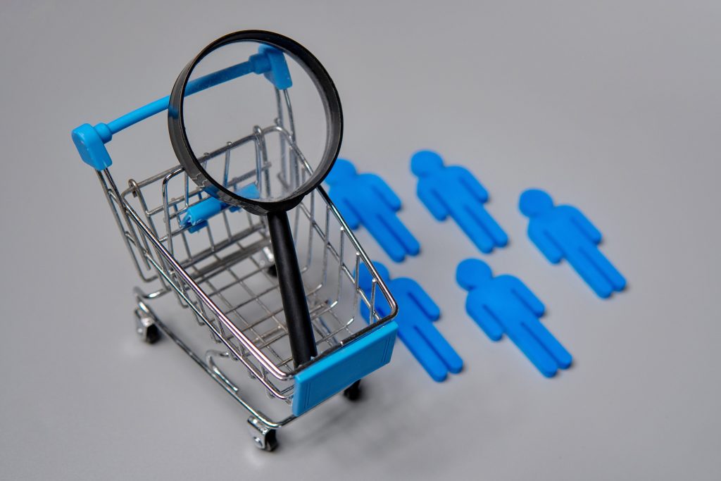
Usability can be broken down into 7 key components
- Learnability – From the moment the user lands on the website, how easy is it for them to accomplish basic tasks?
- Utility – Does the website design perform the functions that user needs?
- Efficiency – How quickly can the user perform the intended task?
- Memorability – Should the user stop using the design for a significant amount of time, how easily can they reestablish proficiency with the design?
- Errors – Does the user make errors while using the design/product. If so, how many errors do they make? Are they easy to fix?
- Satisfaction – How pleasant is it to use the design?
- Accessibility– The site’s content needs to be obtainable and functional to people with disabilities. Accessibility is actually a prerequisite to usability. If a person can not access a web page he certainly can not use it.
Why Usability Matters
Usability is absolutely necessary to the success of your design, product, or website. Let’s consider the usability of a website for example. If the website is cluttered and difficult to navigate, users will leave, increasing your bounce out rate. If your font choices and text blocks aren’t optimized for readability, the user will quickly become frustrated and exit your page. Poor grammar, spelling errors, and slow load times? Say goodbye to your engagement. There are millions of websites, why would a user spend time on yours if it’s not optimized?
The following statistics illustrate how vital usability and user experience (UX) are to the success of your business:
- Nielsen Norman Group conducted a survey of design projects and found that, after redesigning for usability, the average improvement in key performance indicators was 83% The KPIs they metrics they observed included: conversion rates, traffic numbers, user performance, and target feature usage.
- 85% of adults think that a company’s mobile website should be as good or better than their desktop website.
- 88% of users are less likely to return to a website after a bad user experience.
- 40% of people navigate away from a site if it takes more than 3 seconds to load.
- 48% of people cited a website’s design as the number one factor in deciding the credibility of the business.
- 70% of people look at lists with bullet points. 55% look at lists without bullet points.
- According to a study by Forrester, every $1 that’s being invested in UX returns $100. That’s a 9,900% ROI!
Quick Usability Tips for your Business
- The user experience begins before a user visits your site.
- Use heat maps to understand audience behavior.
- Remove time consuming forms to improve cart abandonment.
- Reduce cognitive friction.
- Partner with UI/UX web design experts to map out the necessary changes and give your website a facelift.
Working with J Arthur & Co.
We are committed to delivering exceptional marketing and web services to companies.
Let’s take a look at how J Arthur & Co have enhanced usability for its business partners…

Consider the first image of Wyndham Newport Hotel’s home page. Then take a look at the updated version. A few things should stand out:
- In the before photo, “Book” is a small icon that takes you to a completely separate page where the booking process begins. In the after photo, the user is immediately able to define the parameters of their search by selecting the check in and check out dates, and the number of guests. The “after” layout appeals to utility and efficiency.
- Think about tip number 3 above: “Remove time consuming forms to improve cart abandonment.” By allowing the user to select the dates and the guest numbers on the first page, the most vital information to Wyndham has already been recorded, making the rest of the booking process much more streamlined.
- The before photo has no “contact us” option on the homepage, meaning users would have to click multiple times before finding out how to connect with Wyndham. The after photo has an easily accessible “contact us” option visible in the upper right corner.
By making many smart adjustments like these we were able to completely transform the usability of Wyndham Newport Hotel’s website. Now, instead of clutter and disorganization, the user experiences the efficiency of a clean design that guides them exactly where they need to be as soon as they land on the page. Click here to check out their current website, the difference is night and day.
A website with excellent usability can take your business to the next level! Make sure you partner with a web design agency that understands usability, UI, and UX’s role in driving conversions for your business and meeting your goals.