For business owners and marketers it is also essential to understand the capabilities of effective website design and digital trends. As web technologies develop, so do consumers’ expectations. From subconscious micro-interactions like the mobile ‘swipe down to refresh’ feature, to the use of large serif fonts to denote a luxury or fashion retail brand – it is crucial to serve a consistent and visually coherent digital experience.
Let’s explore some of the key 2020 trends
Illustration & Hand Drawn Graphics
One of the most popular developments in web design in recent months, which is expected to continue throughout 2020 is the widespread use of hand-drawn graphics and abstract or line illustrations. Part of a wider pattern of convergence between digital and print media, the use of illustrated graphics is a refreshing transition from the flat design and ‘web specific’ graphic styles that were ubiquitous just one or two years previous. One of the most powerful aspects of this ‘medium’ in web design is its’ flexibility. Having been around for many decades prior to web design, our expectations and interpretations of illustrated graphics are far more accustomed and so the power these types of graphics has to illicit emotional responses or efficiently convey a message is second to none.
Furthermore with web design and development becoming increasingly flexible and powerful, the need to adhere to ‘the grid’ is no longer relevant. This means out of the box design and ‘broken’ layouts are now a mainstay.
Illustration & Hand Drawn Graphics EXAMPLES:

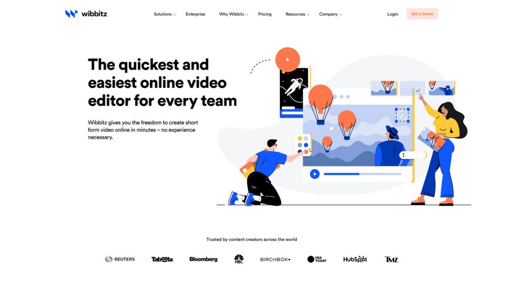
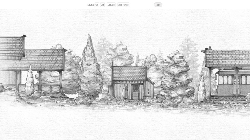
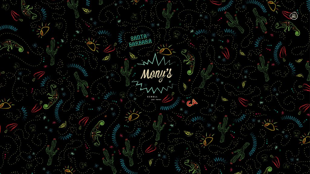
Image References:
1) http://ndesign-studio.com/
2) http://themanyfacesof.com/leonardo-dicaprio/
3) https://www.wibbitz.com/
4) https://alexanderperrin.com.au/paper/shorttrip/
5) https://monyssb.com/
3D Space & Depth
This is a big one! The use of 3D in web design is not necessarily new – ‘Faux’ 3D effects such as parallax backgrounds have been around and popular for some years now, a strong indication as to the general direction web technologies and trends are going. With Virtual Reality, Augmented Reality, and even standard browsers now capable of rendering 3D web experiences – it is widely anticipated that the traditional 2D websites we’re familiar with will soon be a thing of the past.
Needless to say for many reasons a full 3D web experience is a very attractive proposition. Increased user engagement, enhanced story-telling, visual impact, and the array of potential applications all make for a rapidly growing and exciting aspect of contemporary web design. With technologies such as three.js and pixi.js making 3D environments, modeling, and interaction more accessible than ever to web developers, this is one trend that is sure to stick around for years to come.
3D Space & Depth EXAMPLES
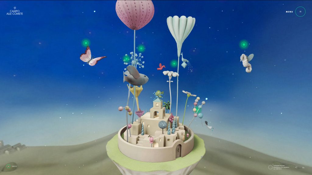
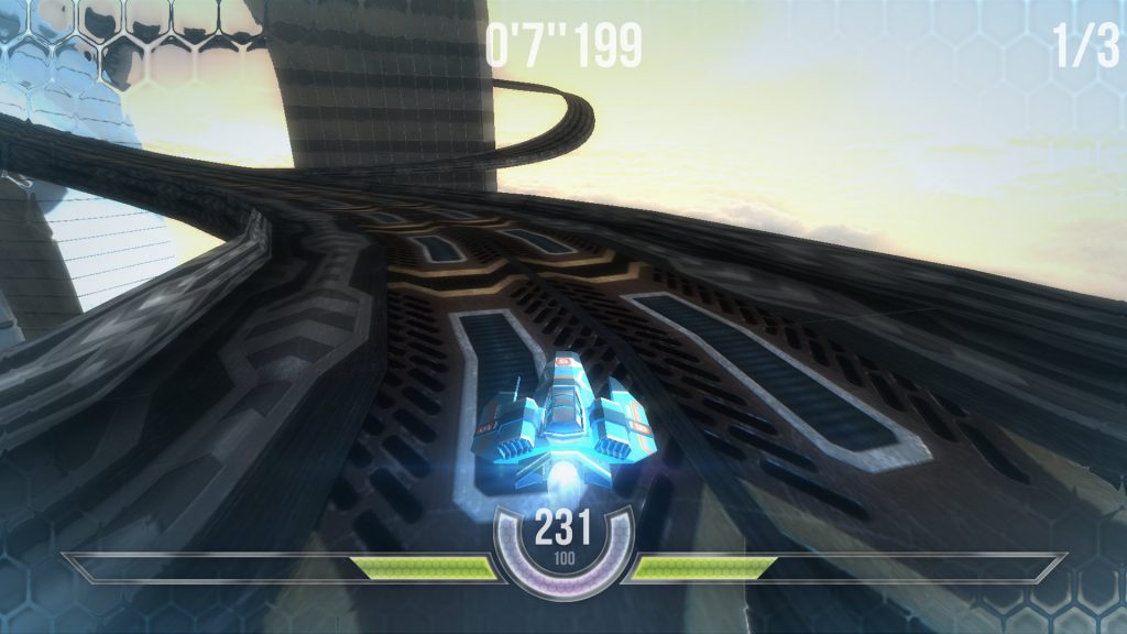
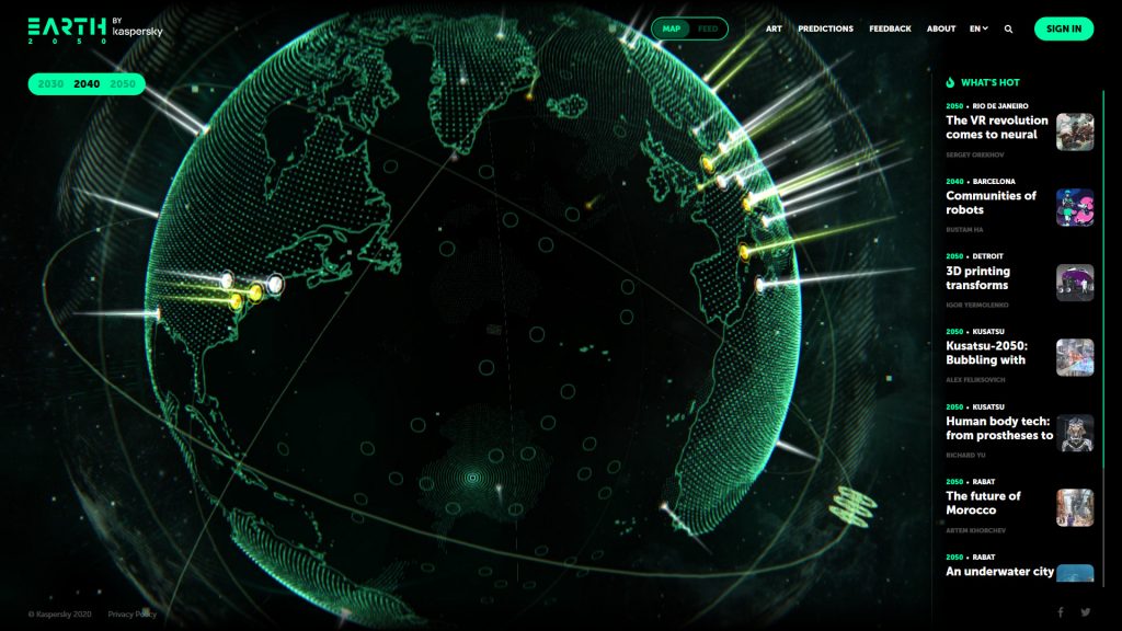
Image References:
1) http://campoallecomete.it/#!/en
2) https://2050.earth/
3) http://hexgl.bkcore.com/play/
4) http://brunoquintela.com/
5) https://showroom.littleworkshop.fr/
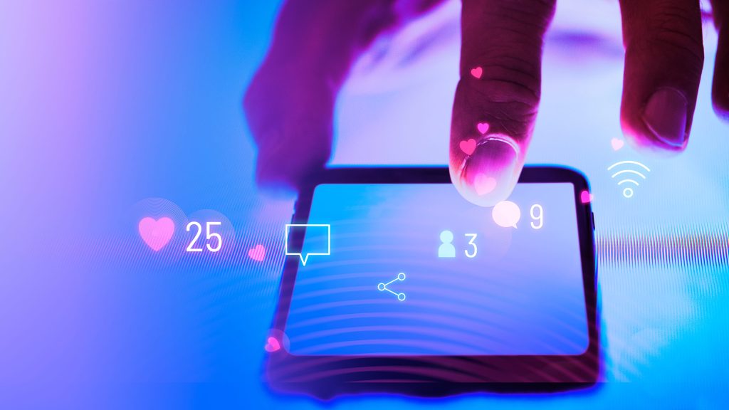
Micro-Interactions
Another ‘technical’ web design trend that is consistently progressing, micro-interactions emerged in recent years and have become a fundamental aspect of our daily lives. Not just in web design, but with all modern digital technologies. A central tenant of effective user experience design is simplification. The ability to provide feedback, illustrate a process, or direct a user as quickly and efficiently as possible is essential. This has been the case for a several years now paving the way for something of an ‘interactive dictionary’ to become established. App users or website visitors now have very specific expectations when it comes to micro-interactions, with the field of user experience having become an industry in its’ own right.
Done right, a simple micro-interaction can convey a vast amount of information while simultaneously reinforcing branding, streamlining processes, and increasing user engagement – an essential tool, and often under-appreciated tool for any business!
Image References:
1) https://dribbble.com/shots/9671764-Add-To-Cart-Interaction
2) https://dribbble.com/shots/8122878-Take-a-photo-interaction
Bold or Print-esque Typography
Visual trends in web design are often enabled by new capabilities and support in web technologies, but are generally driven by a wider context. In the introduction I touched upon the convergence of print and web design – once two very separate and distinct industries – the capabilities of modern web design now allows for much more exciting and innovative layouts once reserved for the printed page. A very obvious example of this that we are sure to see continuing to grow in 2020 is Typography.
Once upon a time typography and imagery in websites were completely separate, with very simple (…and quite boring) usage of typography accompanied by static photos. Thankfully typography is now becoming considered as another ‘graphical element’ – properly integrating with the visual language of a website, and often in combination with other key elements we’ve mentioned such as 3D and Interaction.
One trend in typography as a result if very large, oversized and bold titles in modern websites. And with this having been a central element in print and physical design for decades, it’s no surprise to see.
Interestingly, this example also sheds light on how understanding the wider context and contributing factors can help business owners learn to anticipate the direction of digital and design trends and remain firmly at the forefront.
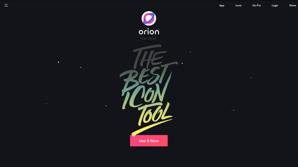
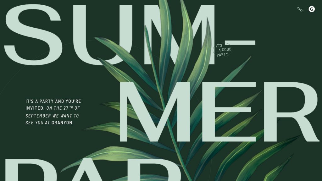
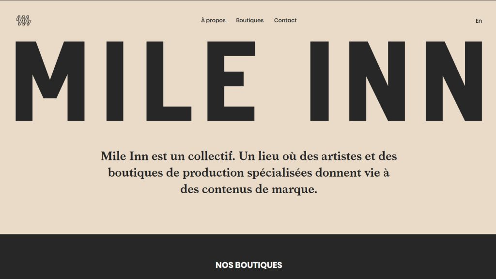
Image References:
1) https://www.createwithplay.com
2) https://orioniconlibrary.com/
3) https://whiteboard.is/
4) https://mileinn.co
Mobile-led Design
“Mobile-Led Web Design’ is not a new trend!” I hear your cry, and in a sense you would be right. In the ever progressing timeline of web technologies it can even be considered ancient. However, mobile and hand-held device usage continues to grow and with it new possibilities and considerations are constantly emerging. For some years now it has been essential for any website to function properly on both desktop and mobile devices; however that is no longer enough.
Throughout 2018-19 mobile usage overtook desktop for viewing websites and that trend has continued to develop. As a response designers are creating ‘mobile first’ websites switching the focus to designing layouts and typography that adhere to conventions for mobile and app design, with desktop experience being secondary.
At the same time, code libraries such as Modernizr give web developers the ability to access numerous features unique to mobile devices such as the ‘Accelerometer’ (the bit of tech in your phone that detects physical rotation and orientation), or even things like brightness detection – imagine a website that automatically adjusts its visual settings or color-scheme based on the amount of light the device is receiving!
Needless to say, as with all these examples of modern web design trends, the possibilities are both exciting and limited only by our imagination!
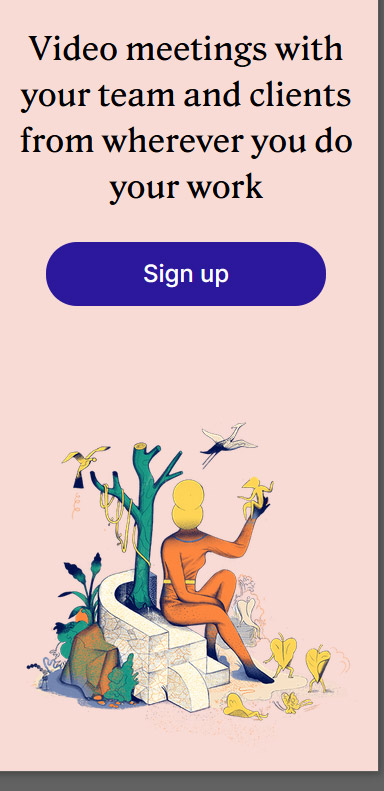
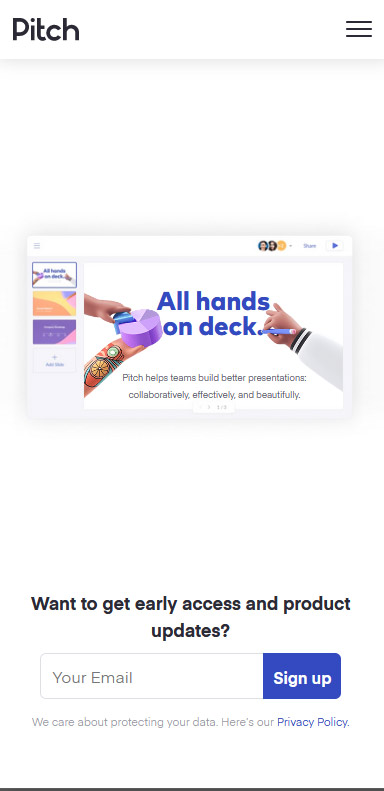
Image References:
1) https://cash.app/
2) https://whereby.com/
3) https://www.typeform.com/
4) https://pitch.com/